Gestalt (form, shape in German) is a group of visual perception principles developed by German psychologists in the 1920s. Its foundation is based on the theory that “an organized whole is perceived as greater than the sum of its parts”.
The Gestalt principles of visual perception are a set of principles that describe how humans perceive and organize visual information. These principles can be applied to UI design to create visually harmonious and effective user interfaces.
Here are the key Gestalt principles for UI design:
Simplicity
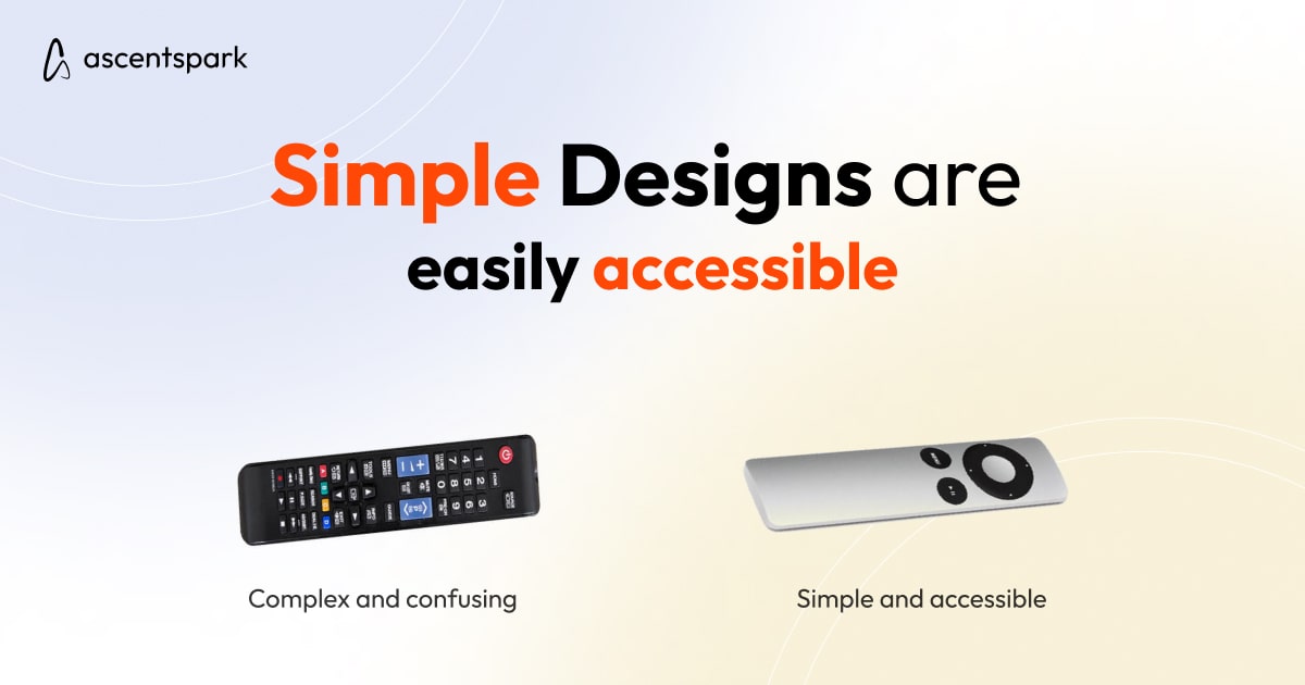
Simplicity is a key principle in UI design, and it aligns with the Gestalt principle of simplicity or the Law of Pragnanz. This principle suggests that humans tend to prefer simple and clear visual structures. UI designers can apply this principle by using clear and concise language, minimalist design elements, and intuitive navigation.
Proximity
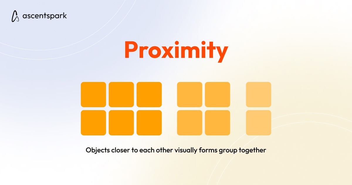
Proximity is a Gestalt principle that suggests that humans tend to group elements that are close together. UI designers can apply this principle by grouping related elements like buttons and text boxes together and separating unrelated elements to make the interface more visually organized and efficient.
Similarity
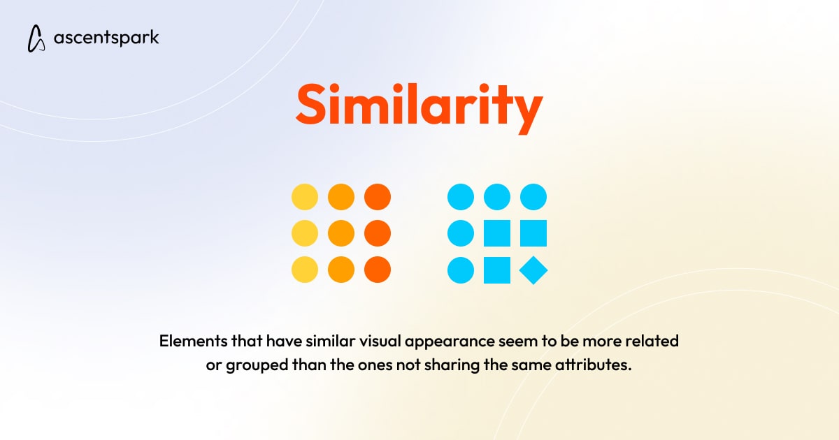
The Gestalt principle of similarity suggests that humans tend to group elements that are similar in color, shape, or size. UI designers can apply this principle by using consistent visual elements like color schemes, font styles, and iconography to create a cohesive and visually pleasing interface.
Continuity
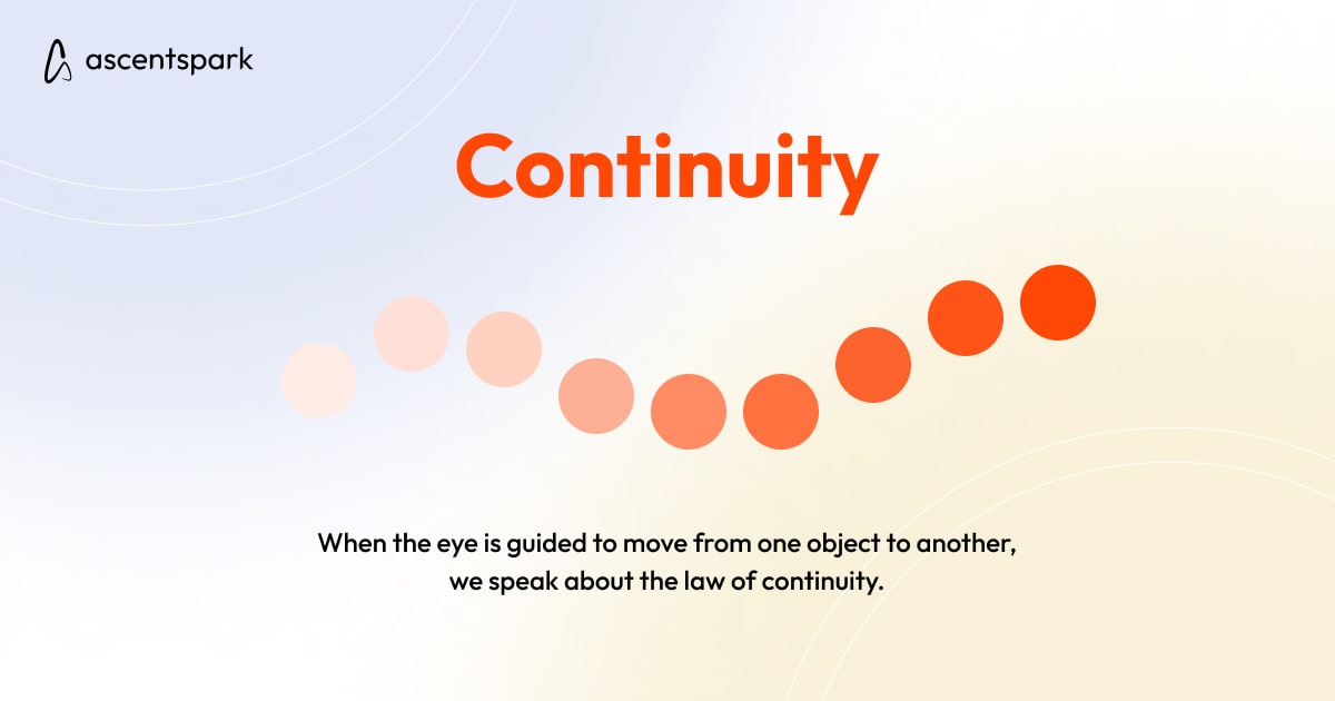
The principle of continuity suggests that humans tend to prefer visual elements that flow smoothly together. UI designers can apply this principle by using consistent shapes, patterns, and lines to create a seamless and natural flow to the interface.
Closure
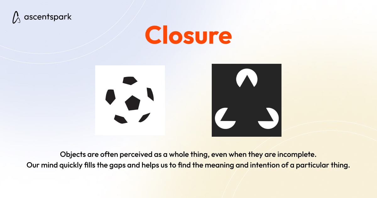
The principle of closure suggests that humans tend to fill in missing information to create a complete visual image. UI designers can apply this principle by using elements like white space, negative space, and subtle cues to help users fill in the gaps and create a complete visual experience.
However, certain things should be kept in mind by UI designers while applying Gestalt principles.
Let’s look at some best practices for applying Gestalt principles in UI design:
Consistency
Consistency is key when applying Gestalt principles in UI design. By using consistent visual elements like color schemes, font styles, and iconography, you can create a cohesive and visually pleasing interface. Consistency also helps users understand the UI and navigate it more efficiently.
Contrast
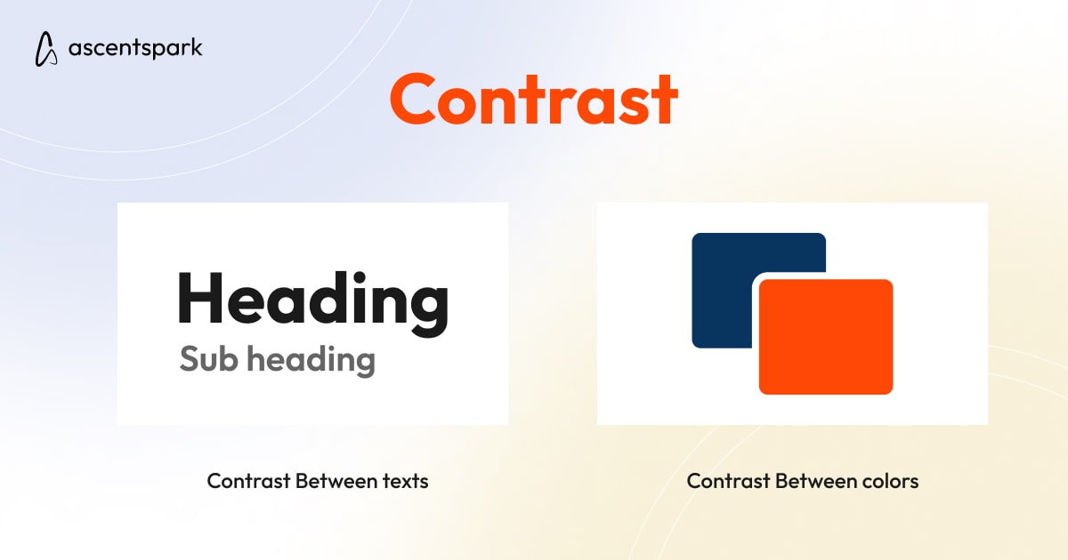
Contrast helps to create visual interest and hierarchy in UI design. By using contrasting colors, sizes, and shapes, you can highlight important elements and make them stand out. Contrast also helps to create a more dynamic and engaging interface.
Hierarchy
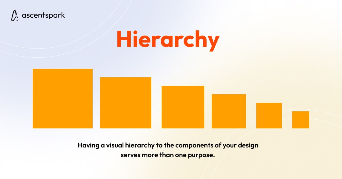
Hierarchy is important in UI design because it helps users understand the relationships between different elements. By using size, color, and placement, designers can create a clear visual hierarchy that guides users through the interface and helps them find what they're looking for.
User Feedback
User feedback is important when applying Gestalt principles in UI design. By testing different visual elements and gathering feedback from users, designers can refine their designs and create interfaces that are more effective and user-friendly.
Use Cases of Gestalt Principles in UI Design
Gestalt principles can be applied to various aspects of UI design to create visually harmonious and effective interfaces.
Here are some use cases of Gestalt principles in UI design:
Layout and Composition
Gestalt principles can be used to create visually pleasing and organized layouts. For example, proximity can be used to group related elements together, while similarity can be used to create consistent visual elements.
Color and Contrast
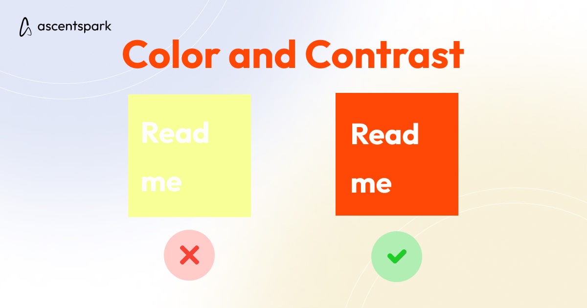
Gestalt principles can be used to create effective color schemes and contrast in UI design. For example, similarity can be used to create a consistent color scheme, while contrast can be used to highlight important elements.
Typography
Gestalt principles can be applied to typography in UI design to create a clear and organized hierarchy. For example, similarity can be used to create a consistent font style, while contrast can be used to highlight important text.
Iconography and Imagery
Gestalt principles can be employed to create effective iconography and imagery in UI design. For example, similarity can be used to create a consistent iconography style, while contrast can be used to highlight important icons.
Interactive Elements
Gestalt principles can be also used to create effective interactive elements in UI design. For example, continuity can be used to create a smooth transition between different states of an interactive element, while closure can be used to create a complete visual experience.
The Gestalt principles of visual perception provide a useful framework for UI designers to create visually harmonious and effective user interfaces. By applying these principles of simplicity, proximity, similarity, continuity, and closure, UI designers can create interfaces that are intuitive, efficient, and aesthetically pleasing.
