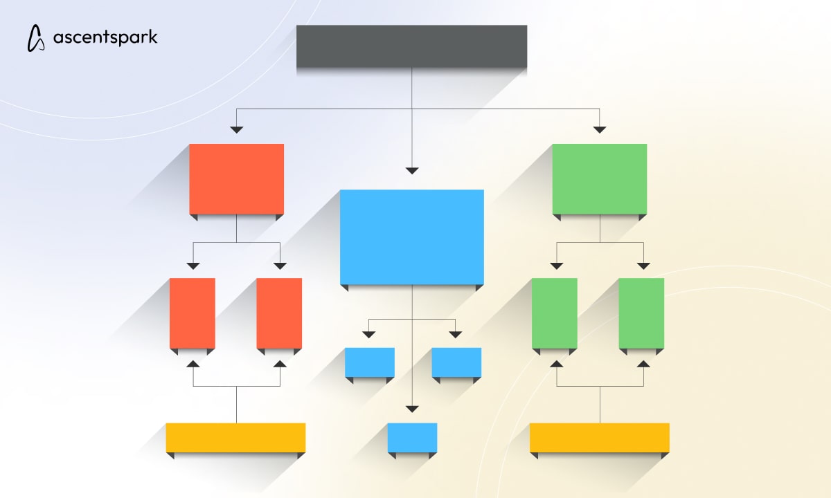
Visual hierarchy is the arrangement and organization of design elements in a way that guides the user's attention through the interface, highlighting important information and creating a clear hierarchy of content. In UI/UX design, visual hierarchy is a critical concept that helps designers create interfaces that are both engaging and easy to use.
Creating a Visual Hierarchy
Here are some ways to create a visual hierarchy in UI/UX design using the industrial principles:
- Size and Scale

Design elements that are larger and more prominent will naturally attract more attention than smaller elements. By making important elements larger and less important elements smaller, designers can create a clear hierarchy of content.
- Color and Contrast
Color and contrast can be used to create a strong visual hierarchy in UI/UX design. By using contrasting colors for important elements, and less contrast for less important elements, designers can guide the user's attention through the interface.
- Typography
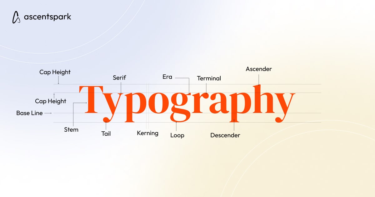
Typography can also be used to create a visual hierarchy in UI/UX design. By using larger, bolder fonts for important headings and titles, and smaller, lighter fonts for less important text, designers can create a clear hierarchy of content.
- Whitespace
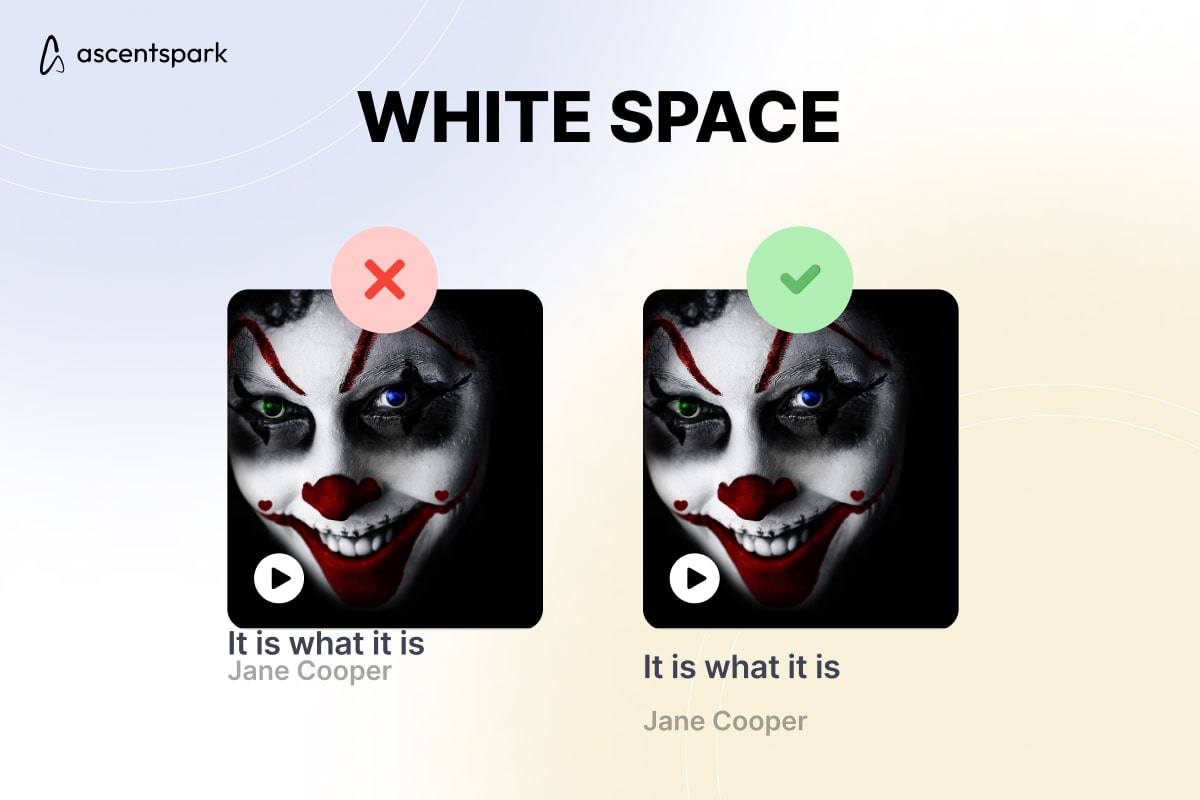
Whitespace can be used to create a clear visual hierarchy in UI/UX design by providing breathing room between different design elements. By using whitespace to separate important elements from less important elements, designers can create a clear hierarchy of content.
- Contrast
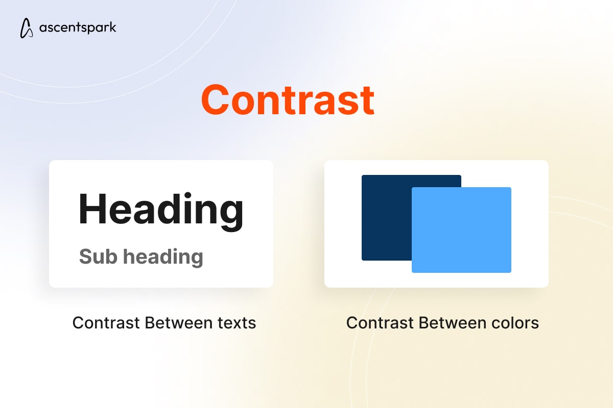
Contrast can be used to create a visual hierarchy by making important elements stand out from the surrounding design. By using contrasting colors, fonts, and other design elements, designers can create a clear visual hierarchy that guides the user's attention through the interface.
- Alignment and Proximity
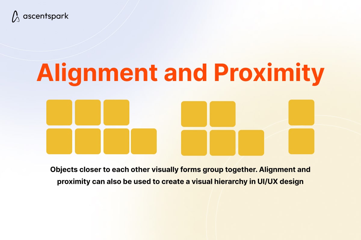
Alignment and proximity can also be used to create a visual hierarchy in UI/UX design. By aligning related design elements and grouping them together, designers can create a clear hierarchy of content that guides the user's attention through the interface.
The principles of visual hierarchy are critical in UI/UX design, as they help designers create engaging and easy-to-use interfaces. By using size and scale, color and contrast, typography, whitespace, contrast, alignment, and proximity, designers can create a clear hierarchy of content that guides the user's attention through the interface.
Benefits of Visual Hierarchy
The benefits of creating a visual hierarchy in UI/UX design include:
- Guiding the user's attention through the interface
- Highlighting important information
- Creating a clear hierarchy of content
- Improving the overall user experience
Use Cases of Visual Hierarchy in UI/UX Design
- Navigation Menus
Navigation menus are a critical part of any UI/UX design, and visual hierarchy is key to making them effective. By using size and scale, color and contrast, typography, and whitespace, designers can create a clear hierarchy of navigation items that guides the user through the interface.
- Call-to-Action Buttons
Call-to-action buttons are another important part of UI/UX design, and visual hierarchy is critical to making them effective. By using size and scale, color and contrast, typography, and whitespace, designers can create call-to-action buttons that stand out from the surrounding design and encourage users to take action.
- Headings and Titles
Headings and titles are important for organizing content and guiding the user's attention through the interface. By using larger, bolder fonts for important headings and titles, and smaller, lighter fonts for less important text, designers can create a clear hierarchy of content that guides the user through the interface.
- Images and Graphics
Images and graphics are important for engaging users and providing visual interest in UI/UX design. By using size and scale, color and contrast, and alignment and proximity, designers can create a clear hierarchy of images and graphics that guides the user's attention through the interface.
- Forms and Input Fields
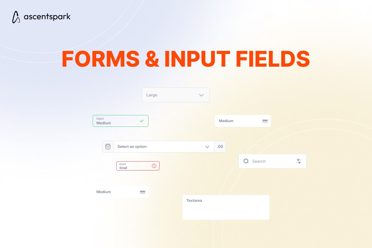
Forms and input fields are a critical part of many UI/UX designs, and visual hierarchy is important for making them easy to use. By using size and scale, color and contrast, typography, and whitespace, designers can create a clear hierarchy of form fields that guides the user through the input process.
- Data Tables and Charts
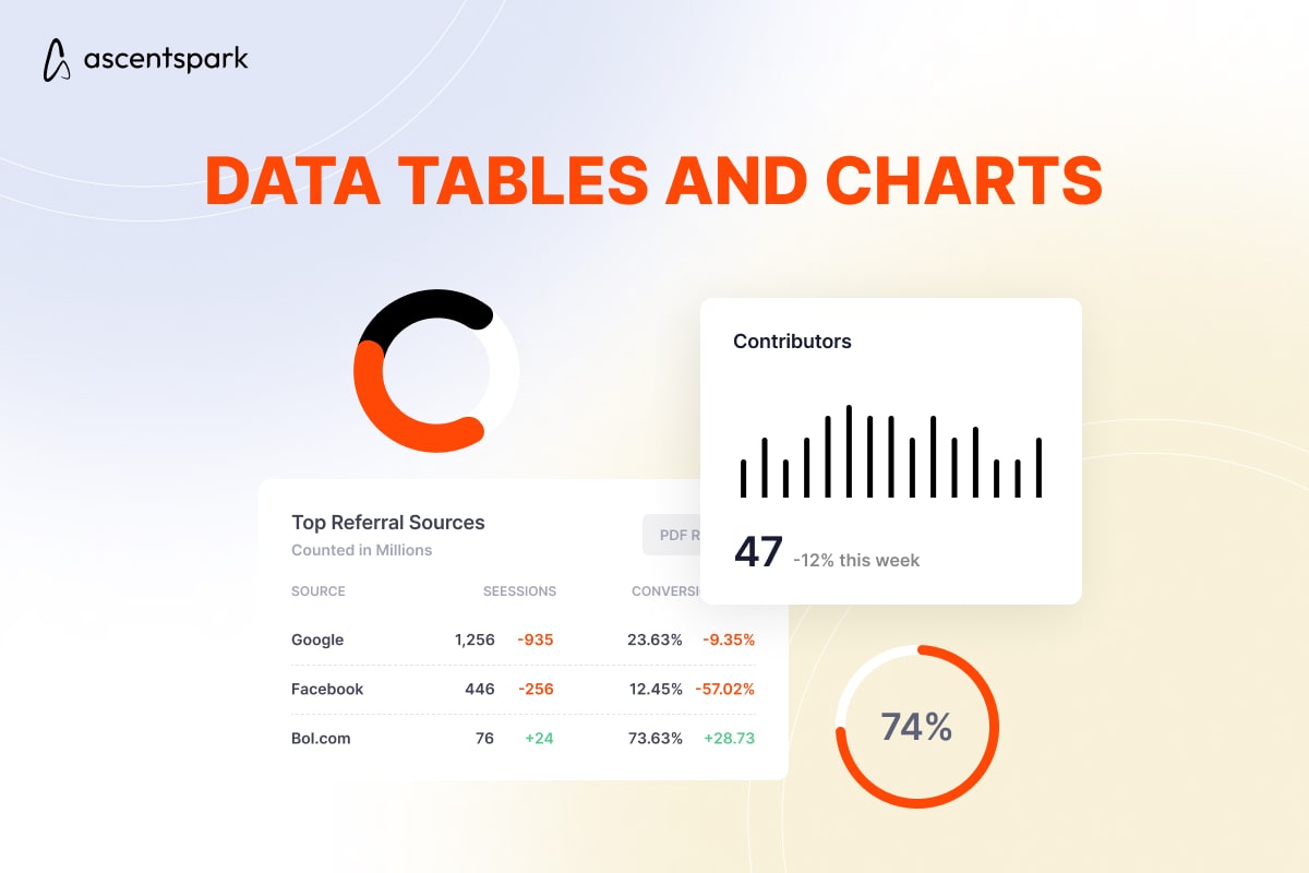
Data tables and charts are important for presenting complex information in UI/UX design, and visual hierarchy is critical for making them easy to understand. By using color and contrast, typography, alignment and proximity, and other visual cues, designers can create a clear hierarchy of data that guides the user through the information presented.
Visual hierarchy is an important concept in UI/UX design that helps designers create engaging and easy-to-use interfaces. By using size and scale, color and contrast, typography, and whitespace, designers can create a clear hierarchy of content that guides the user's attention through the interface
